TRAIN
HARD.
RISE
ABOVE.
Gabe Jones, MSES • Performance Coach
CERT
SCIENCE-BACKED.
RESULTS-DRIVEN.
Gabe Jones isn't just a trainer. He's a Master of Science in Exercise Science who programs with precision and coaches with intensity. Whether you're stepping into a gym for the first time or you're an athlete chasing an edge, Gabe builds programs around you.
Based in Chicago. Training everywhere. From Peace Runners 773 community workouts to elite 1:1 sessions, Gabe shows up where the work is.
CHOOSE YOUR
TRAINING PATH

The most direct route to your goal. Every rep, every set, every session built entirely around you.
- Custom program for your specific goal
- Real-time coaching & form correction
- Full accountability every session
- Progressive overload tracking
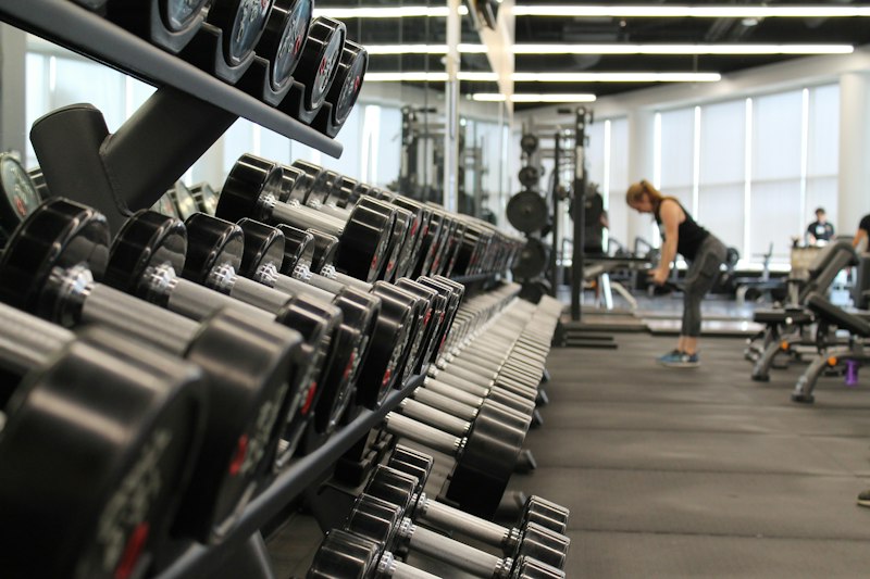
Small groups of 3-5. Expert coaching, a competitive environment, and a crew that pushes you.
- Groups of 3-5 athletes max
- Expert coaching fully present
- Community-driven accountability
- Better pricing than 1:1

Gabe's methodology delivered digitally. Science-backed, custom-built, train on your schedule anywhere.
- 100% custom to your goals & equipment
- Train anywhere, any time
- Check-ins and program updates
- Available nationwide
FOLLOW THE
JOURNEY
REAL PEOPLE.
REAL RESULTS.
Gabe doesn't just hand you a program -- he teaches you why every movement matters. I hit a PR every single month.
Lost 28 lbs in 4 months. Online programming made it possible with my schedule. Gabe checks in and keeps you locked in.
As a basketball player, performance is everything. My vertical jumped 4 inches in 8 weeks. The science is real.
READY TO
RISE
ABOVE?
Fill this out and Gabe will personally reach out within 24 hours. No sales pressure -- just a real conversation about your goals.
Gabe will personally reach out within 24 hours.
APPLICATION RECEIVED
Gabe will reach out within 24 hours.
Get ready to Rise Above All.
How to find an image's pixel width & height (so you can add width/height attributes)
- Open in a browser tab: Right-click the image link and choose "Open image in new tab". The browser's status bar or the tab title sometimes shows dimensions. If not, continue to DevTools.
- Use DevTools Console (quick & reliable):
// Run in the page that contains the image // Replace the selector if needed (use the full src URL to be exact) const img = document.querySelector('img[src="IMAGE_URL.jpg"]'); console.log(img ? img.naturalWidth + ' x ' + img.naturalHeight : 'image not found'); // Or, if you opened the image directly in its own tab: // In the console, run: const i = document.querySelector('img'); console.log(i.naturalWidth + ' x ' + i.naturalHeight); - Download & check file properties:
- Windows: Right-click the downloaded file > Properties > Details > Image (shows width x height in pixels).
- Mac: Right-click > Get Info, or open in Preview and choose Tools > Show Inspector (i) > Info to see pixel dimensions.
- Open in an image editor (Photoshop, GIMP, Preview): open the file and check Image > Image Size (or similar) to see exact pixel width/height.
- Use an online inspector/metadata tool: upload or paste the image URL into sites like "Get-Metadata.com", "snoopy" or "ImageMagick identify" web front-ends; they return pixel dimensions and file size.
Exact HTML examples
Once you have the pixel dimensions (for example 1200 x 800), add explicit width and height attributes to the img tag for layout stability, and keep it responsive with CSS.

Notes: keep width/height as the image's intrinsic pixels (naturalWidth/naturalHeight). Browsers use those attributes to reserve the aspect ratio while CSS (max-width:100%; height:auto;) keeps images responsive. If you regenerate scaled files for srcset, ensure each file's dimensions match its descriptor.
If you want, I can find and insert the exact naturalWidth/naturalHeight for any image directly into the img tag in your code — say "Yes, add dimensions" and I will update the HTML with the correct values.